Web design for lawyers: how small Australian law firms can turn websites into client magnets
In today’s digital-first world, your law firm’s website isn’t just a placeholder—it’s your front door, your receptionist, and your best salesperson. For small Australian law firms, effective web design can mean the difference between consistent leads and deafening silence.
This guide breaks down what great web design for lawyers looks like, with real Australian examples, design features that work, and a checklist to elevate your firm’s online presence.
Why your law firm’s website matters
Most potential clients will visit your website before they ever call you. Within 5 seconds, they’re asking themselves:
-
“Do these people look credible?”
-
“Can they help with my issue?”
-
“How do I get started?”
If your site is outdated, cluttered, or hard to use on mobile, many won’t stick around to find out. But with just a few smart design choices, your site can start doing what it’s supposed to—generate qualified inquiries.
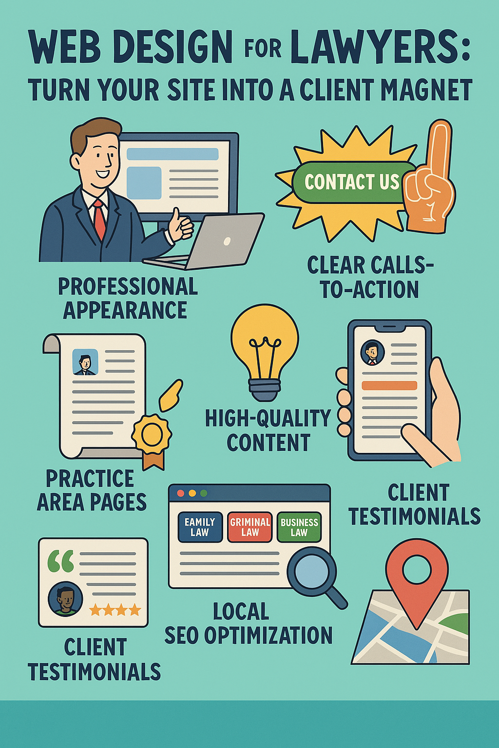
Core principles of law firm web design
1. Make your first impression count
Use a clean layout, clear headline, and professional imagery. Think minimalist, not templated. Avoid stock courtroom photos—real staff images build trust.
2. Focus on client problems, not firm ego
Instead of: “We’ve been around since 1995,”
Try: “Need a separation lawyer who’ll help you avoid court?”
3. Make it mobile-first
Over 60% of visitors come from mobile devices. Responsive design is non-negotiable for SEO and user experience.
4. Use clear calls to action
Every page should prompt a next step:
“Book a consultation” | “Start your will online” | “Download our free separation checklist”
5. Build trust with social proof
Feature testimonials, Google reviews, and logos of legal associations (e.g. Law Society, LIV).
Real examples of great law firm websites in Australia
Here are five excellent examples of Australian firms getting web design right. You can screenshot these sections for visual inspiration.
1. Moores Legal (VIC)
Why it works:
-
Clean layout and calming colour palette
-
Insightful blog for nonprofits, elder law, and education
-
Real staff photography builds trust

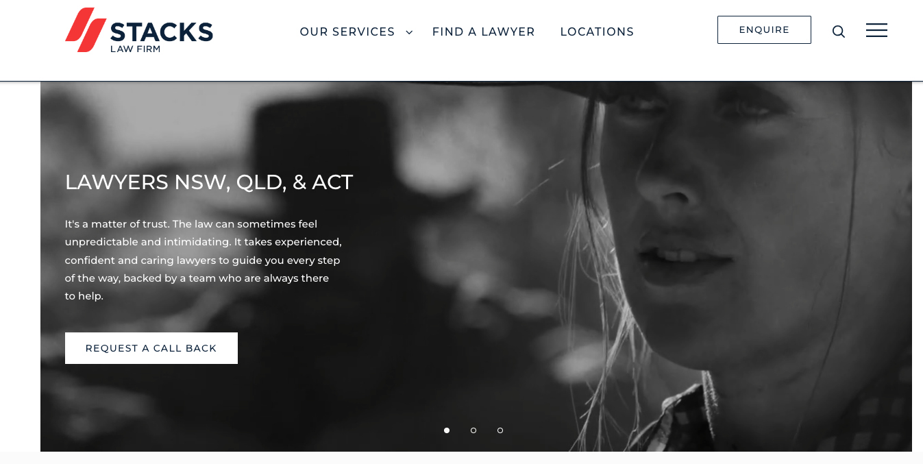
2. Stacks Law Firm (NSW)
Why it works:
-
Localised content for each office
-
Helpful blog organised by legal issue and location
-
Clear service navigation with real client imagery
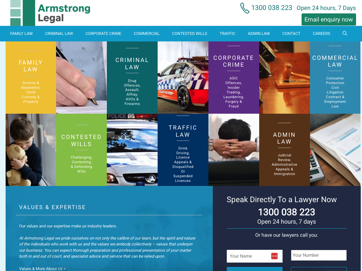
3. Armstrong Legal (National)
🔗 https:
Why it works:
-
Deep content structure and sidebar navigation
-
Loads fast, works well on mobile
-
No-nonsense design that’s easy to read
4. LegalVision (National)
Why it works:
-
SaaS-inspired design: bold icons and CTAs
-
Legal services explained in plain English
-
Offers free legal templates and chat feature

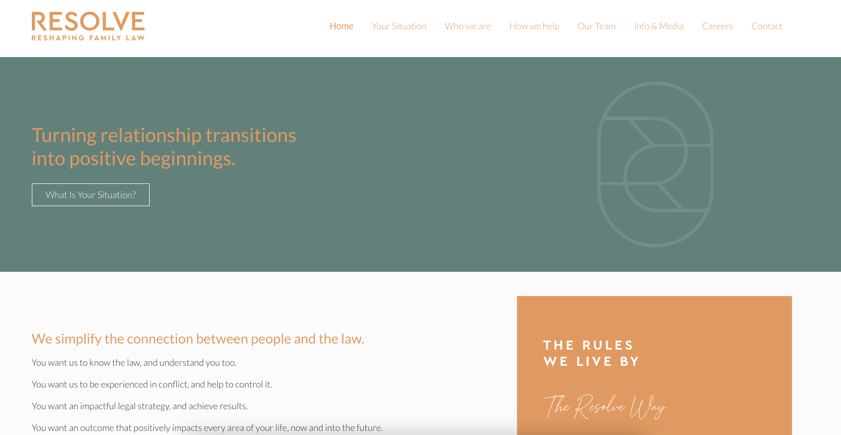
5. Resolve Divorce (SA)
🔗 https:
Why it works:
-
Soft, approachable branding
-
Service descriptions use everyday language
-
Testimonials and FAQs clearly displayed

What your firm’s site should include
Here’s a quick checklist to help you self-assess or brief a designer:
-
✅ Mobile-responsive design
-
✅ Clear CTAs on every page
-
✅ Real staff photos
-
✅ Easy-to-use menu with services clearly listed
-
✅ Blog or resource section
-
✅ Testimonials and accreditations
-
✅ Contact form or booking tool (that actually works)
Common mistakes to avoid
-
❌ Too much legal jargon
-
❌ Homepage that starts with “Welcome to our firm…”
-
❌ Outdated designs or logos
-
❌ Generic stock photography
-
❌ No mention of location or area of law
-
❌ No social proof (Google reviews, Law Society logos)
FAQ
What’s the biggest mistake lawyers make with websites?
Focusing on themselves instead of the client. Your homepage should speak to client problems first.
How much should a law firm website cost?
Between $3,000–$10,000 depending on pages, SEO, and integrations. It’s an investment that pays for itself.
How long does it take to build?
4–6 weeks is realistic if you’re working with a law firm-focused agency like Easy Lawyers Online.
Call to action
If your site isn’t converting visitors into clients—or if it just looks dated—it’s time to upgrade.
Easy Lawyers Online builds fast, SEO-optimised websites for Australian law firms that actually work.
✅ Let me know if you now want:
-
A downloadable Word or HTML version
-
A custom infographic with these 7 website features
-
Help writing image captions or adding more SEO structure (like meta and FAQ schema)
Law firm websites in 2025 are shifting away from brochure-style layouts and toward client-focused, action-driven experiences. Here’s what’s trending among high-performing sites in Australia:
➤ Focused landing pages instead of bloated navigation
Firms are simplifying their menus. Instead of listing “About Us,” “Team,” “Services,” “Practice Areas,” “Resources,” and “Contact” separately, they’re combining pages or using clean drop-downs.
Tip: Try combining pages into streamlined paths like:
-
“How we help” → Practice areas
-
“Our lawyers” → Profile cards with contact buttons
➤ Legal content is being simplified (finally)
You don’t need to sound like a barrister writing a High Court judgment.
Modern law firm websites write in plain English—even for complex areas like wills, family law, or contracts. Google loves it, and clients do too.
Example phrase shift:
❌ “Our firm offers comprehensive dispute resolution services for all commercial litigation matters.”
✅ “We help businesses resolve disputes—fast, and without dragging things through court if possible.”
➤ Lead capture is more interactive
Instead of “Call us now” or “Send us an enquiry,” firms are using:
-
Chat widgets
-
Intake quizzes (e.g. “Are you ready for a parenting plan?”)
-
Downloadable checklists + email follow-up
-
Calendly or Setmore for bookings
Design trends lawyers should ignore
Not every trend that looks slick works for law firms. Here’s what to skip:
❌ Scrolling video intros or autoplay music
People are coming to your site to get legal help—not to watch a 3D logo animation or hear a piano loop.
❌ Ultra-minimal designs with no information
If a client can’t tell in 5 seconds what kind of lawyer you are, you’ve lost them. White space is good, but so is clarity.
❌ Social media-style layouts
Don’t bury your firm’s credibility behind TikTok-style layouts. You’re not a media brand—you’re a service provider. Prioritise trust.
Performance matters: How fast should a law firm website be?
According to Google, if your website takes more than 3 seconds to load, you lose visitors—especially on mobile.
Tools to check your speed:
Ask your developer to optimise:
-
Image sizes
-
Hosting performance
-
Font and script loading
-
Code minification
And always compress your images before uploading (use tools like TinyPNG).
Tools to improve your law firm website today
You don’t need to wait for a redesign to start improving your site. Try these tools:
| Goal | Tool |
|---|---|
| Booking appointments | Calendly or Setmore |
| Compressing images | TinyPNG |
| Writing faster | ChatGPT or Jasper |
| SEO performance | Ubersuggest or Ahrefs |
| Google visibility | Google Business Profile |
Bonus: What law firm clients actually want from your site
-
Clear answers to their legal questions
-
Proof that you’ve handled similar cases
-
Options for how to get started (call, email, book online)
-
Confidence that you’ll listen and act in their best interest
-
Simplicity — fast, mobile-friendly, and no legalese
Ask yourself: Would someone with no legal experience feel comfortable on my site?
Final call to action
If your law firm’s website isn’t bringing in the right clients—or any at all—it’s time to rethink the design, the content, and the user experience.
🎯 Easy Lawyers Online builds SEO-optimised, conversion-driven websites specifically for small and mid-size Australian law firms.
Book a call, get a site audit, or ask for a quote—it all starts with knowing your website could be working harder for you.